Filter By
-
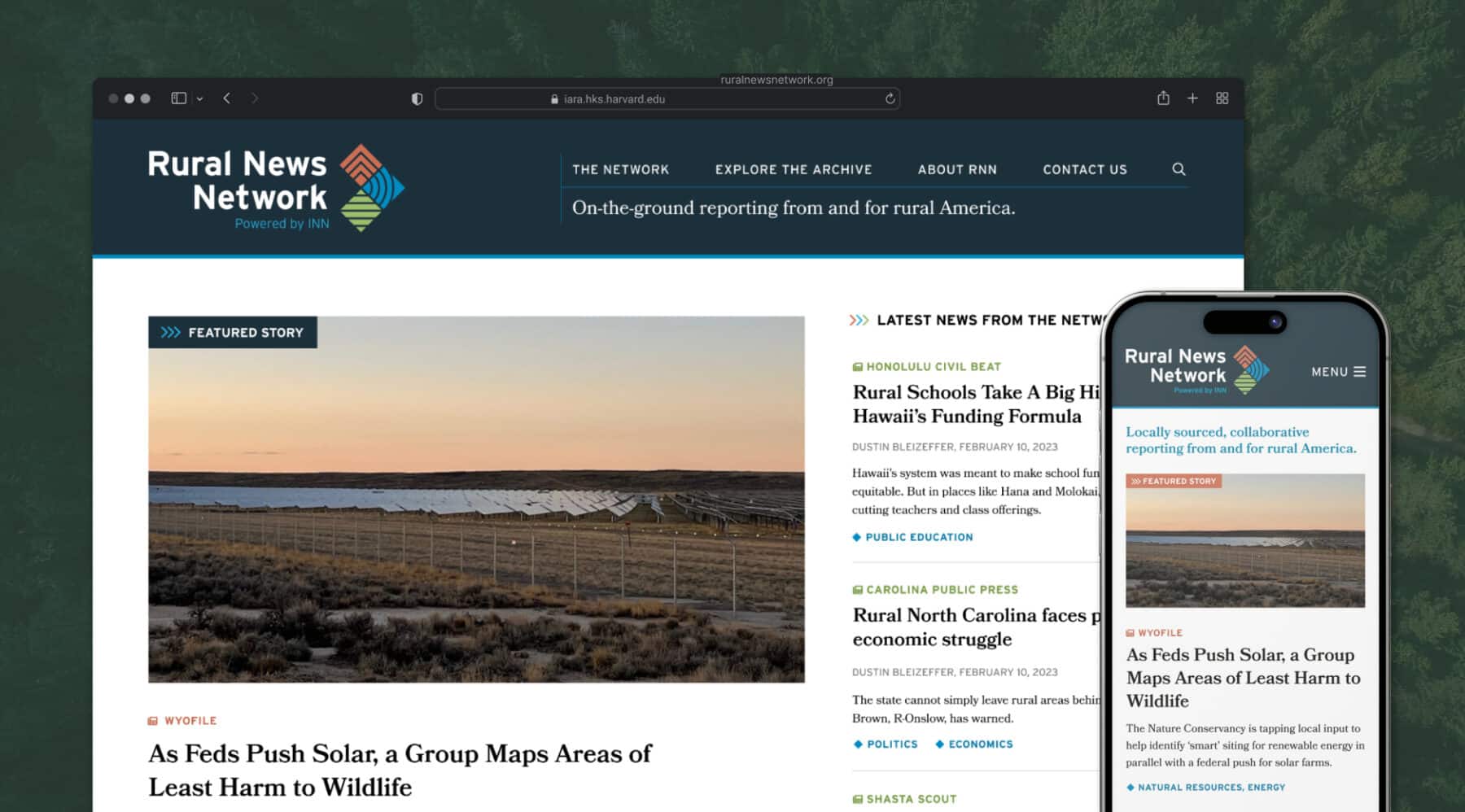
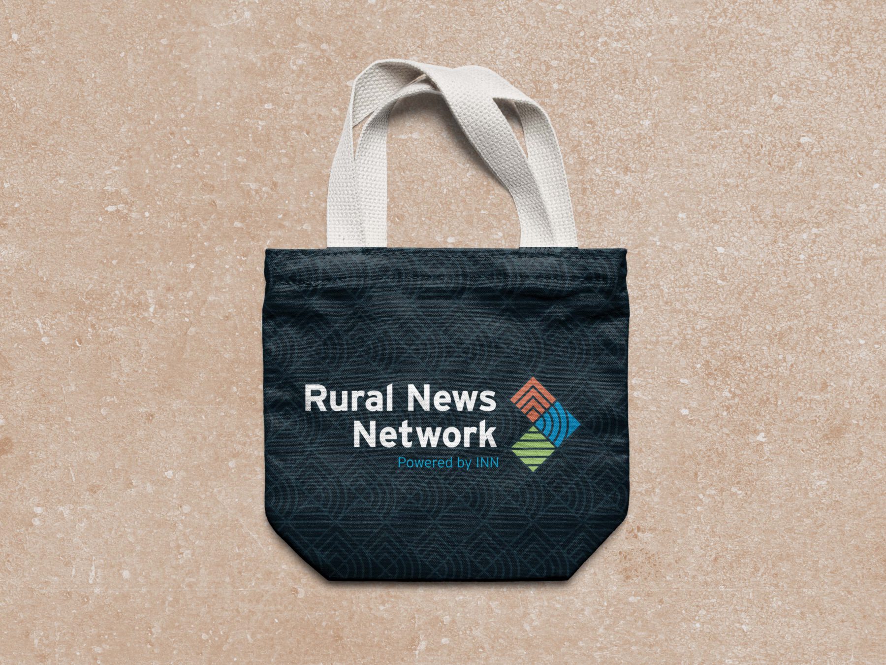
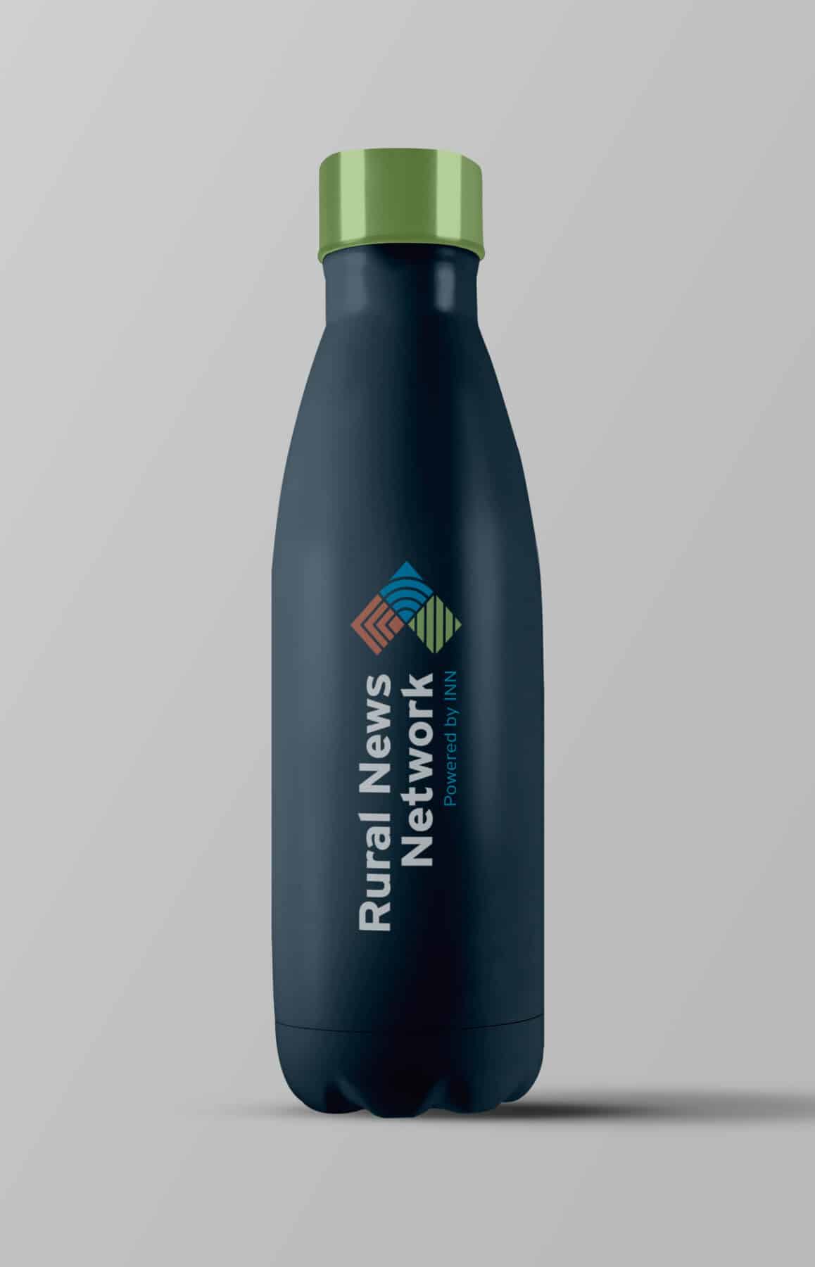
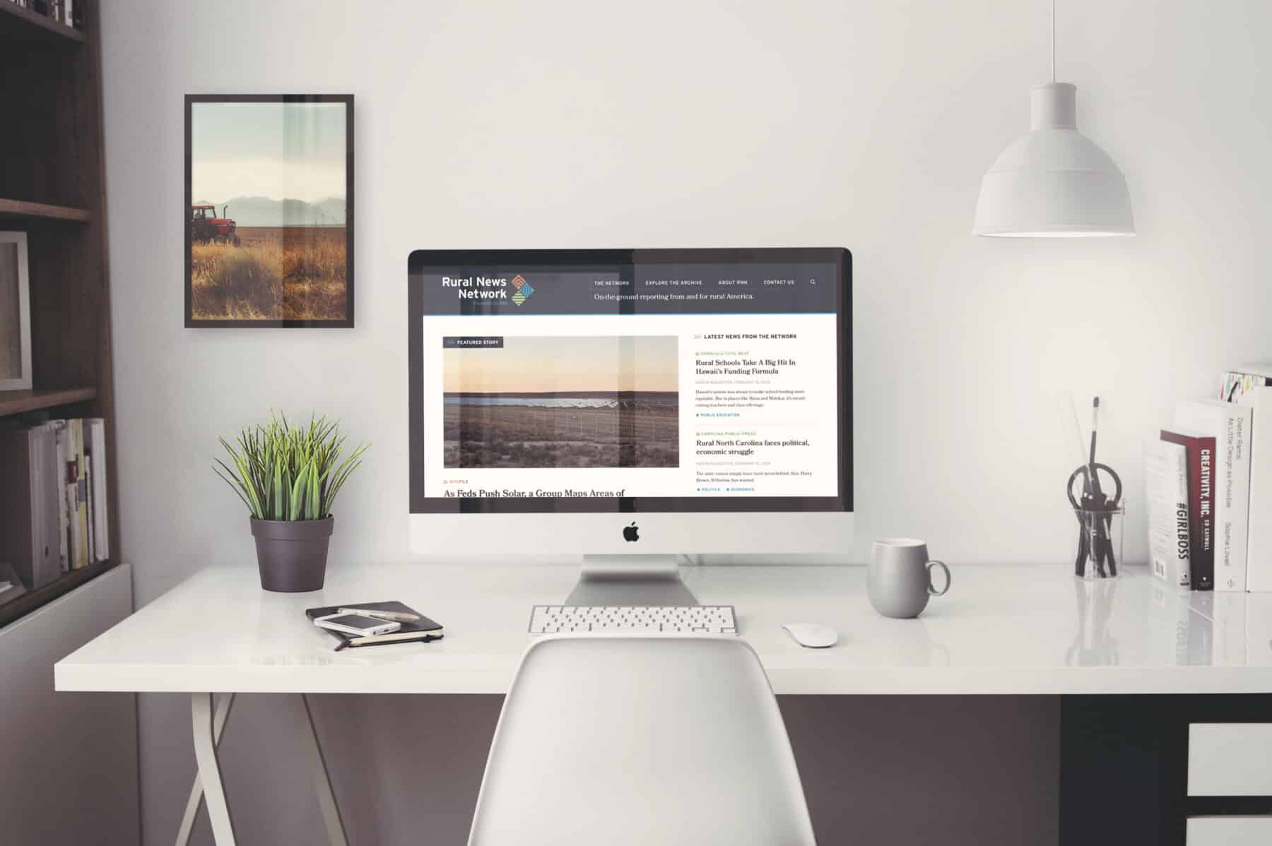
Rural News Network
A logo and website for the Rural News Network — a project of the Institute for Nonprofit News — that built on INN’s existing grid-based brand to create a unique logo of its own, representing the three primary rural landscapes of coast, mountain, and farmland. The RNN website showcases the work of rural newsrooms nationwide, by aggregating daily posts from each partner’s RSS feed. It allows the RNN team to spotlight the best collaborative reporting for rural America.
-
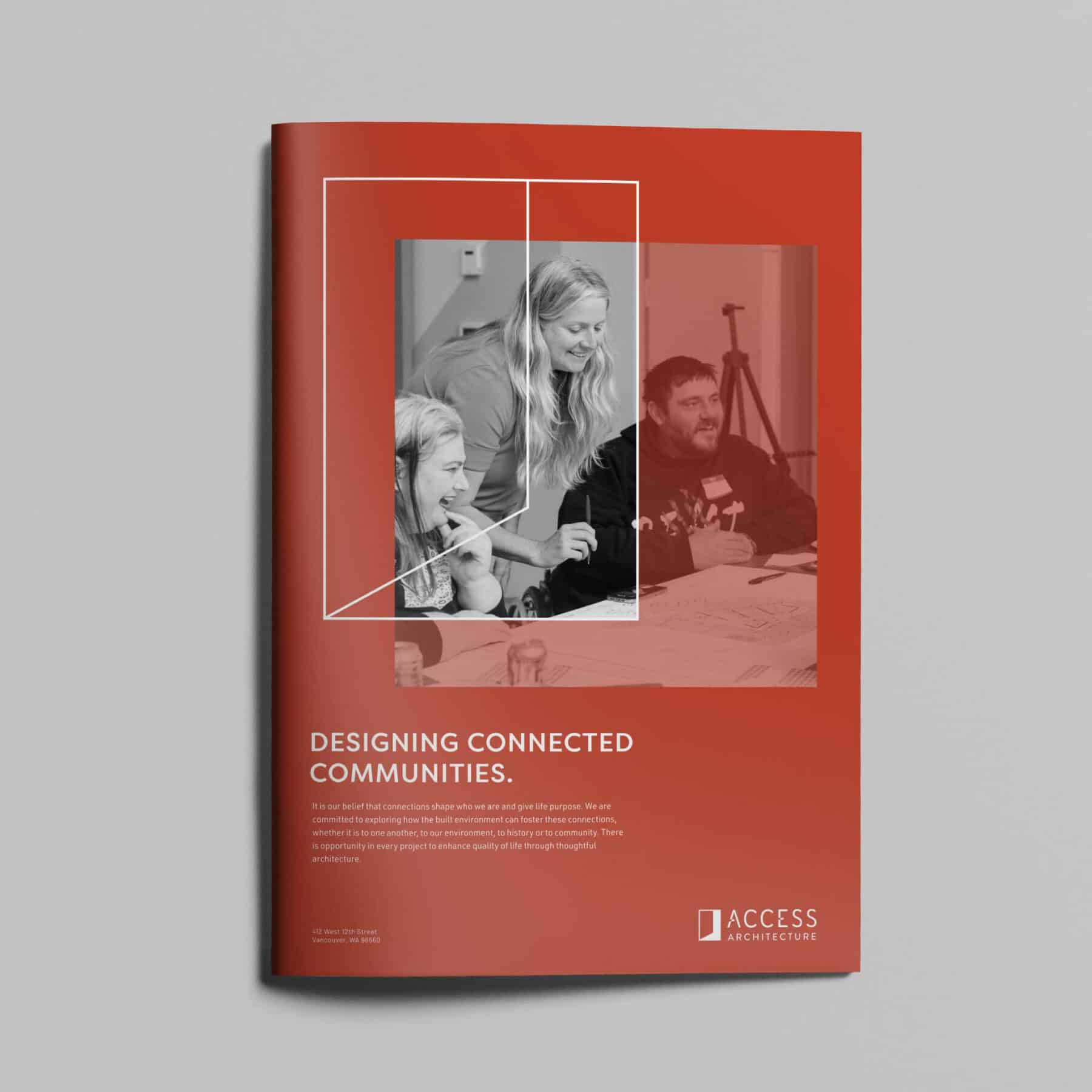
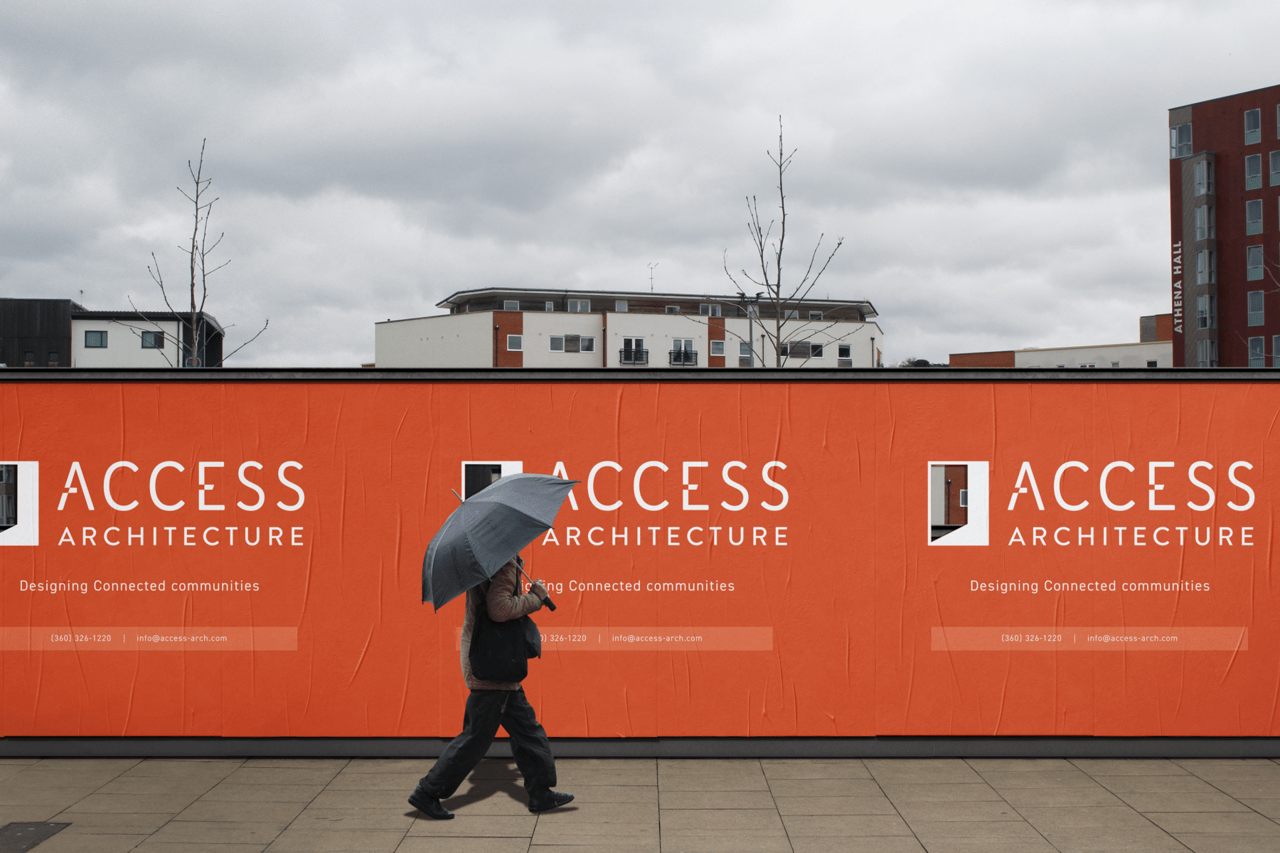
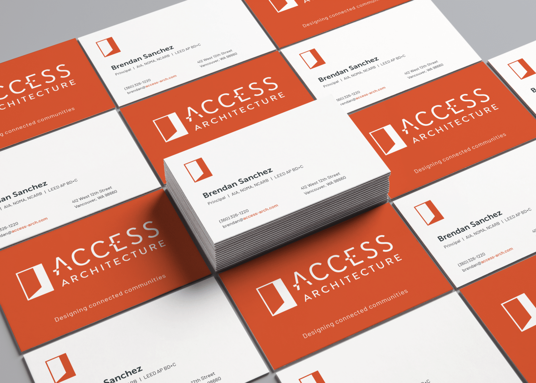
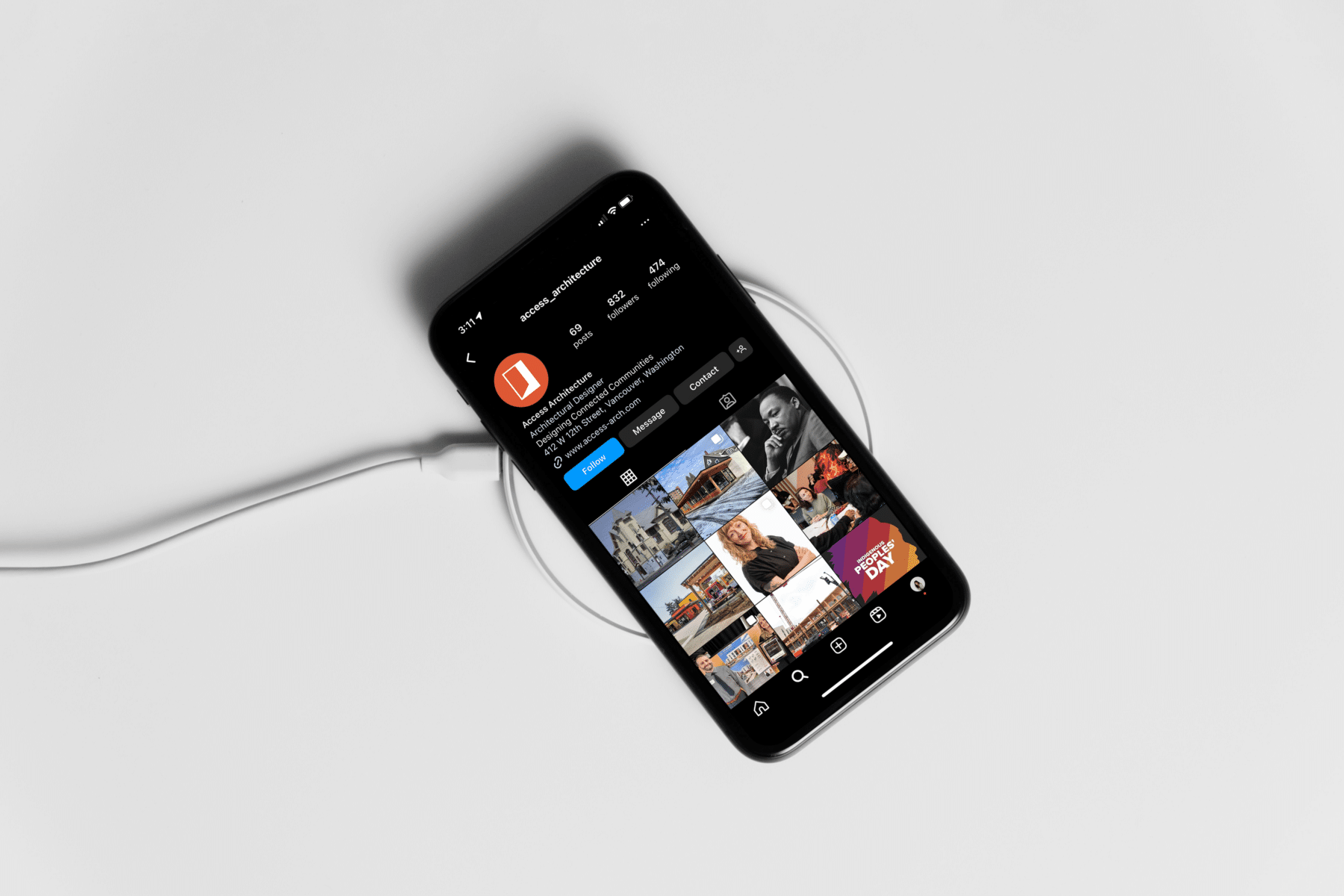
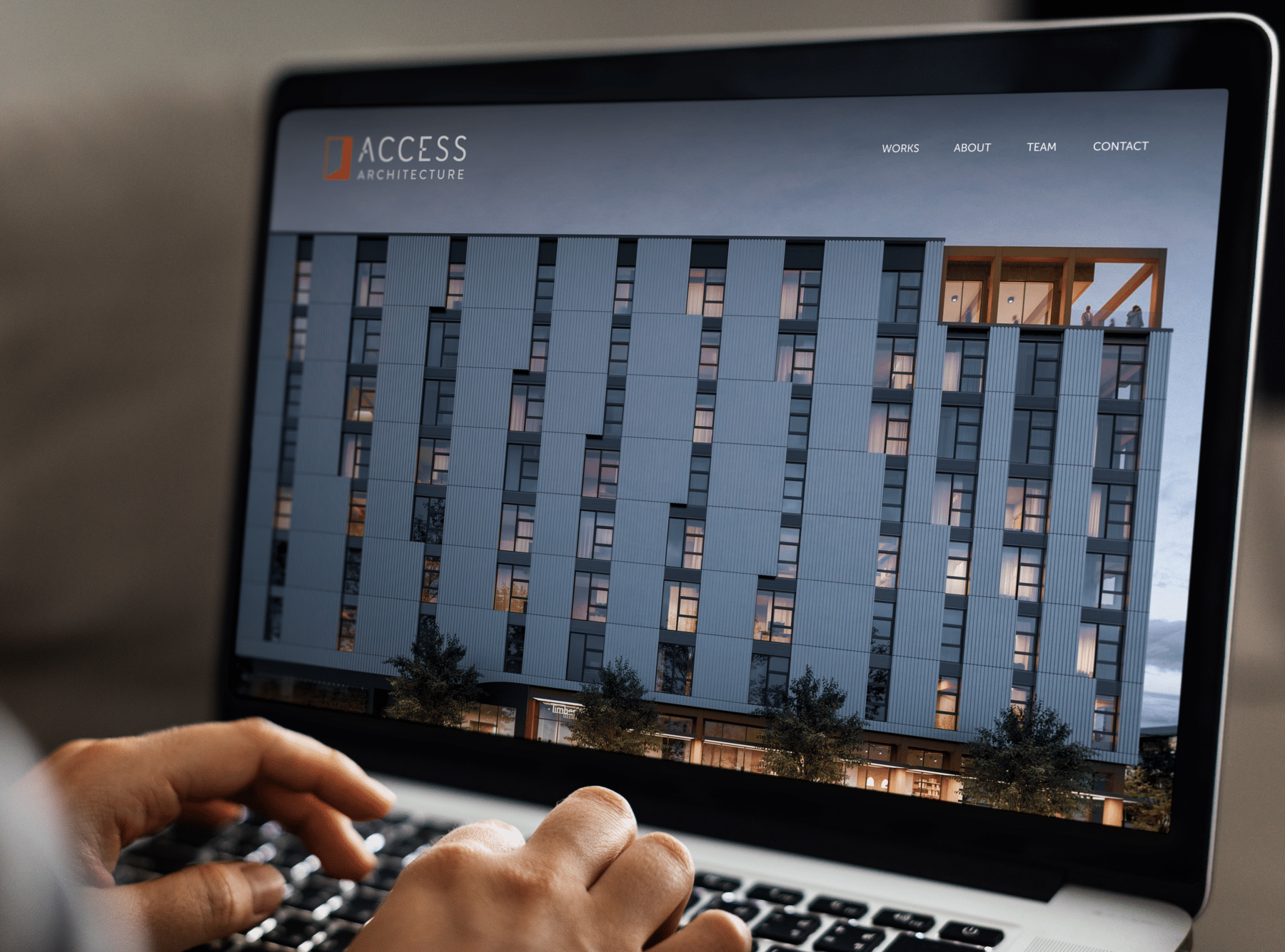
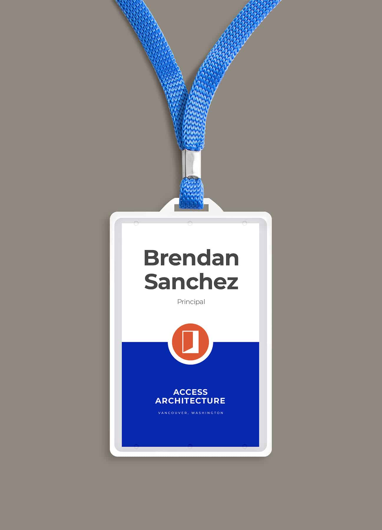
Access Architecture
A full logo system for a Washington architecture firm, showcasing their design sensitivity as well as core values of openness, community, and engagement.

-
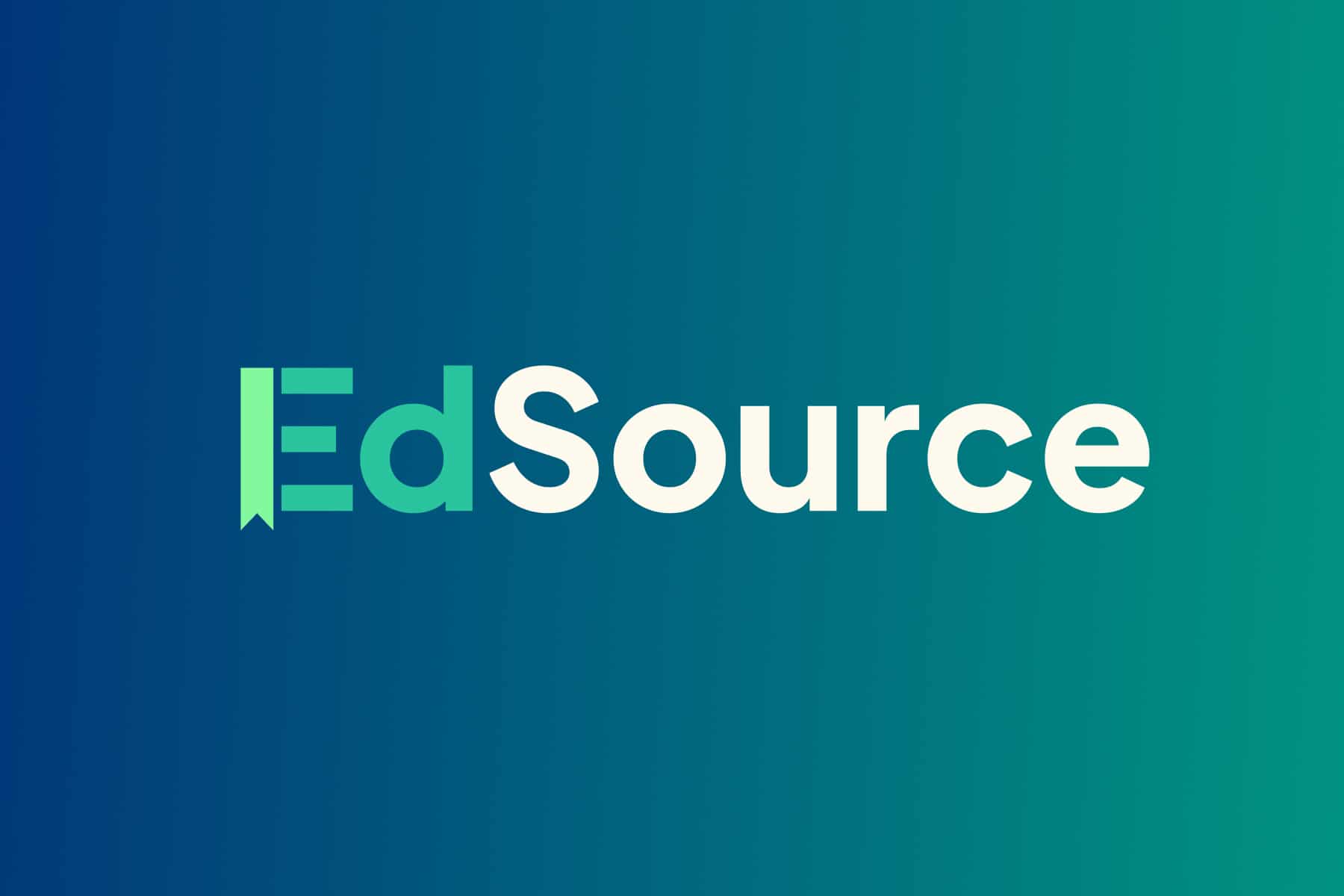
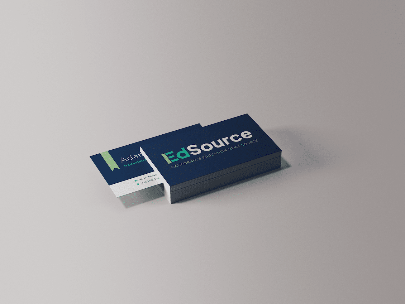
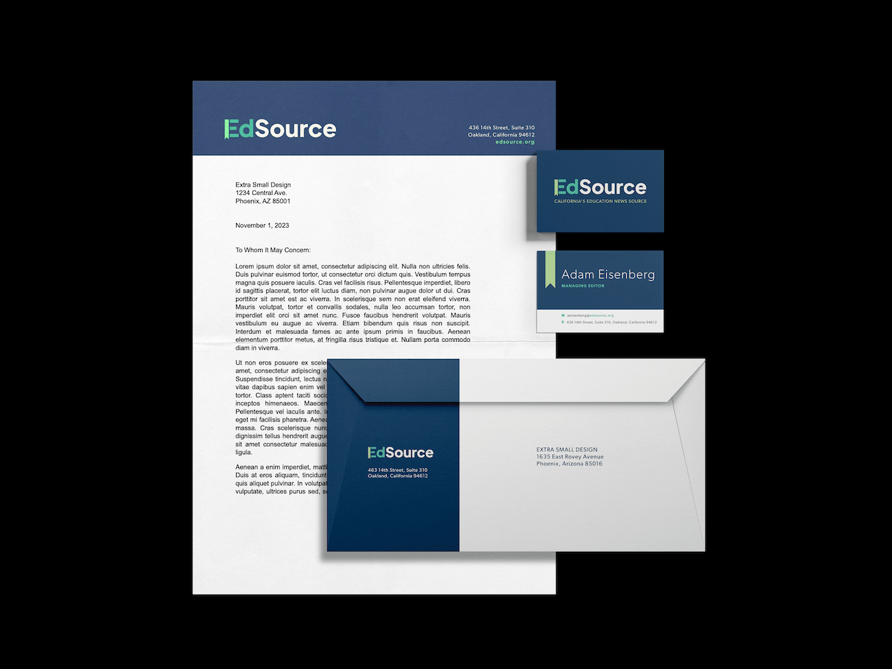
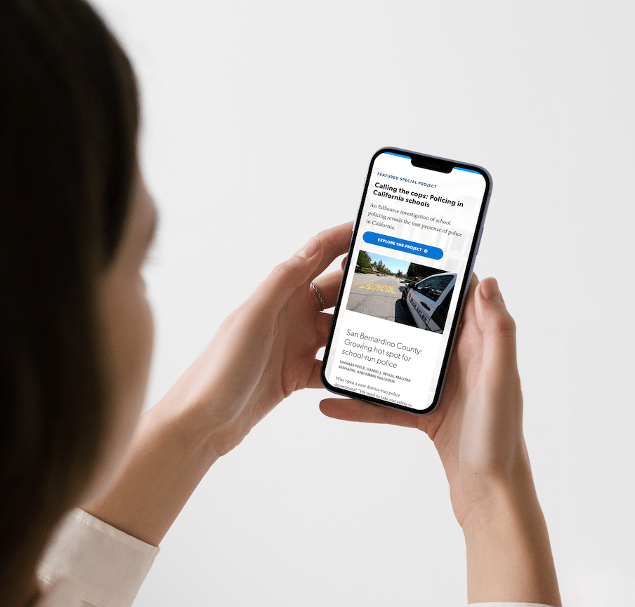
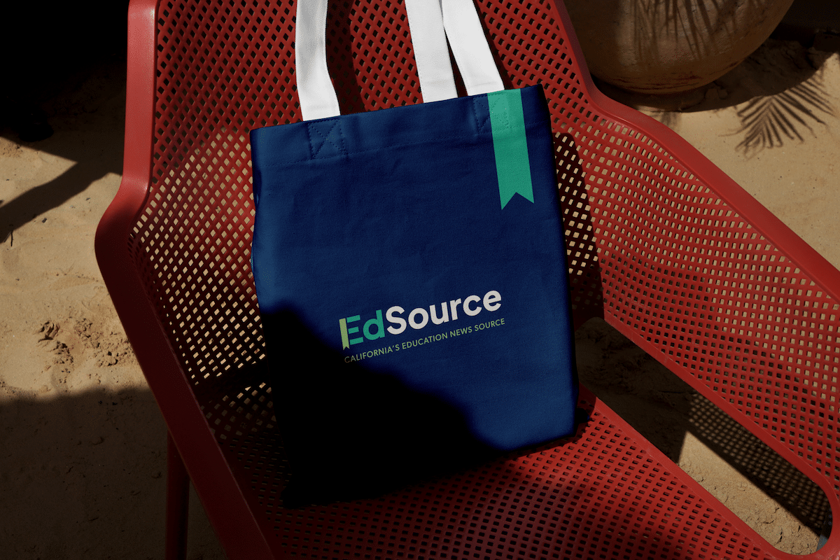
EdSource
EdSource, a California-based nonprofit education news site, came to us for a full brand system to accompany our work on major visual and functional updates to their website. We were able to evolve their color scheme and logo to reflect the approachable, credible expertise they bring to the golden state’s education arena. The bookmark element of the logo maintains their learning focus, and is also used to highlight featured content and provide an easily-recognizable icon.
-
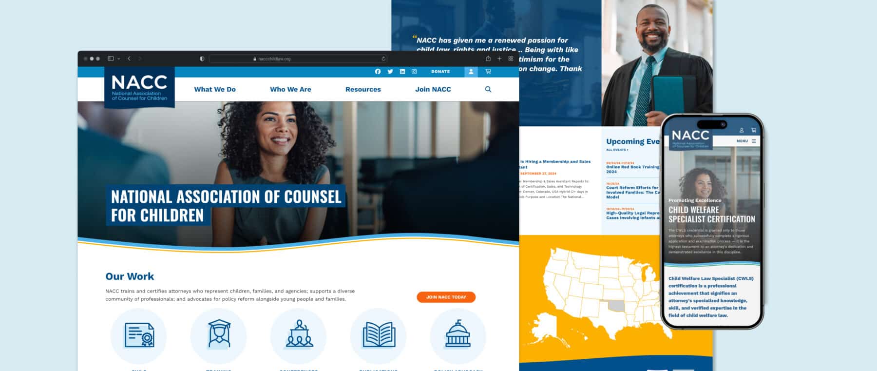
National Association of Counsel for Children
The National Association of Counsel for Children (NACC) is a nonprofit professional organization dedicated to advancing justice for children, youth, and families. We worked closely with the NACC team to understand their goals from both an organizational and administrative perspective. We designed and built a custom WordPress website, leveraging WooCommerce, to provide an integrated membership platform. The site features a store to sell memberships, handle event registration, sell physical products, and allow access to member-only digital content and resources.
-
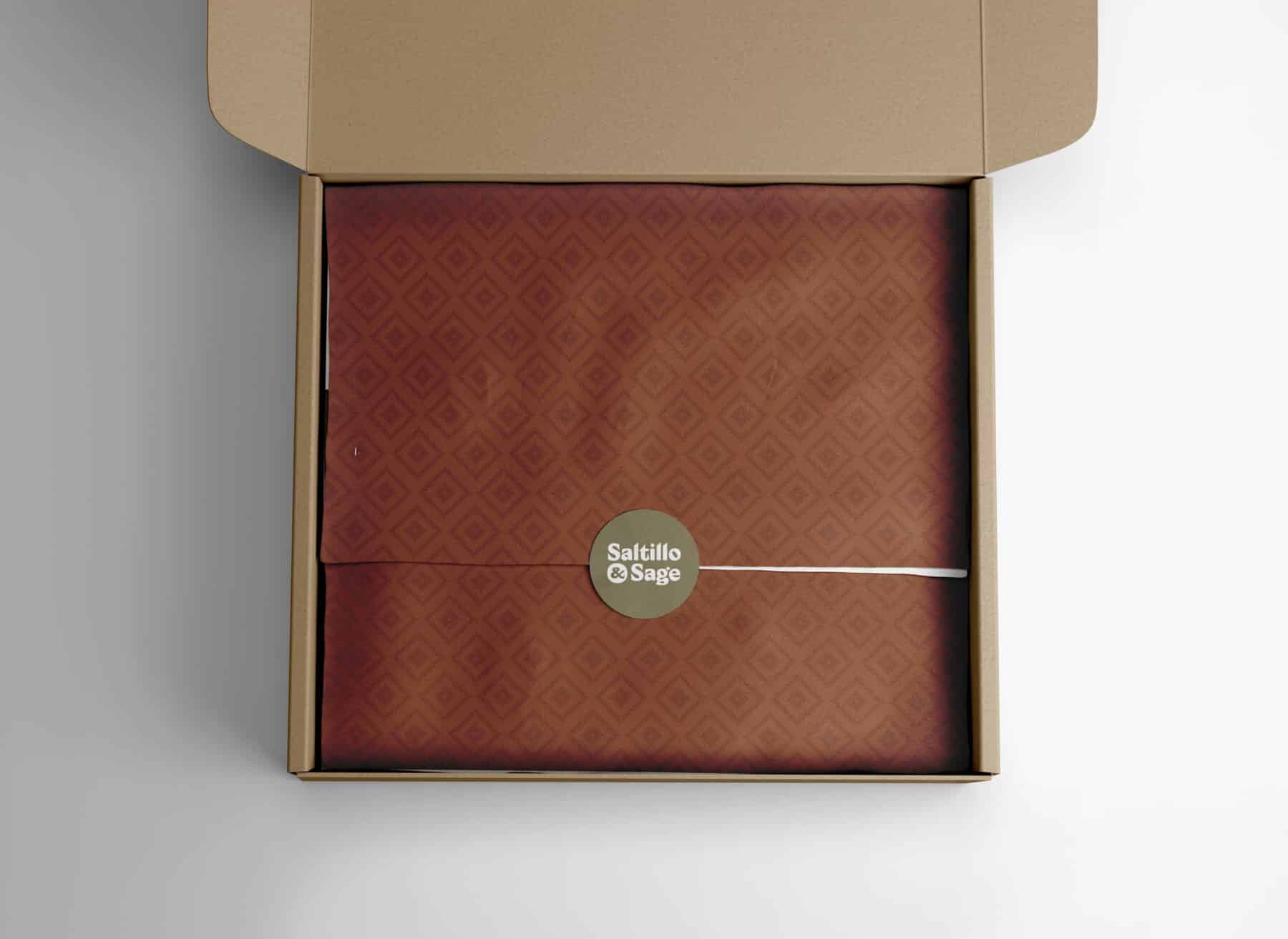
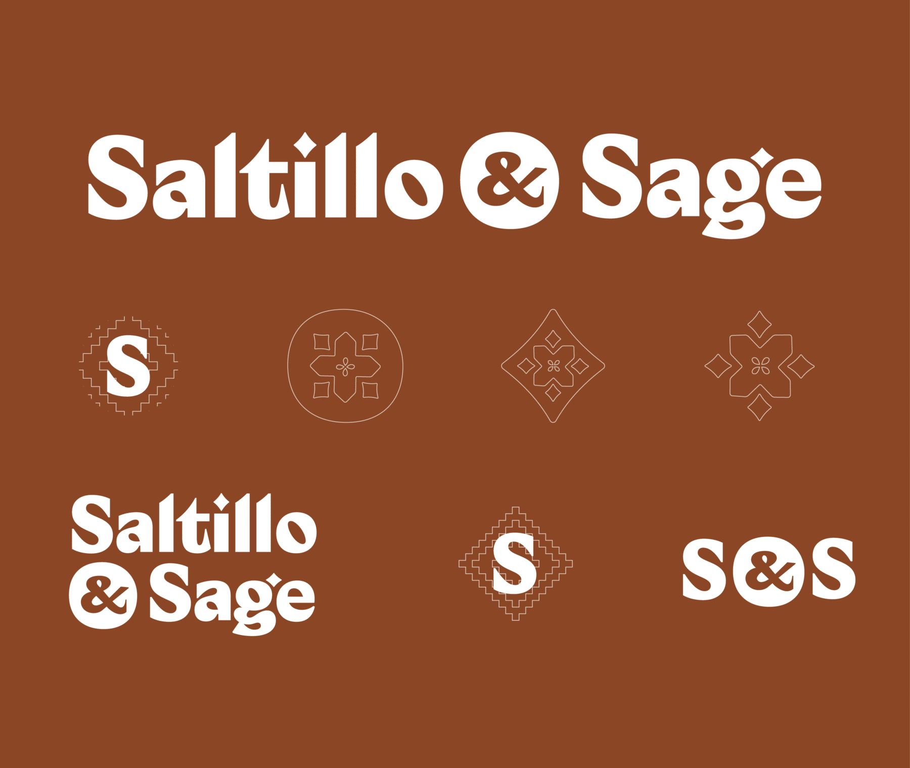
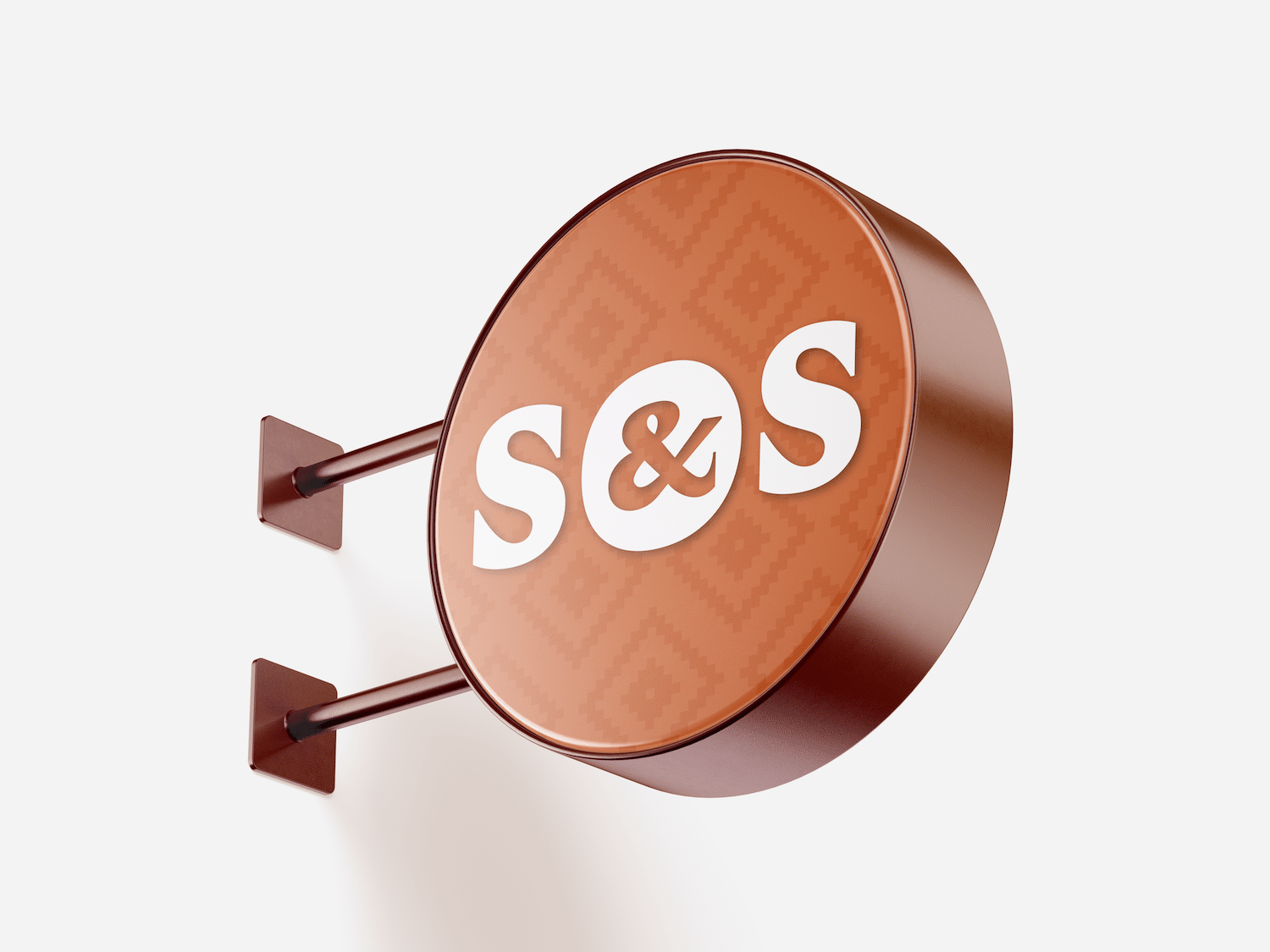
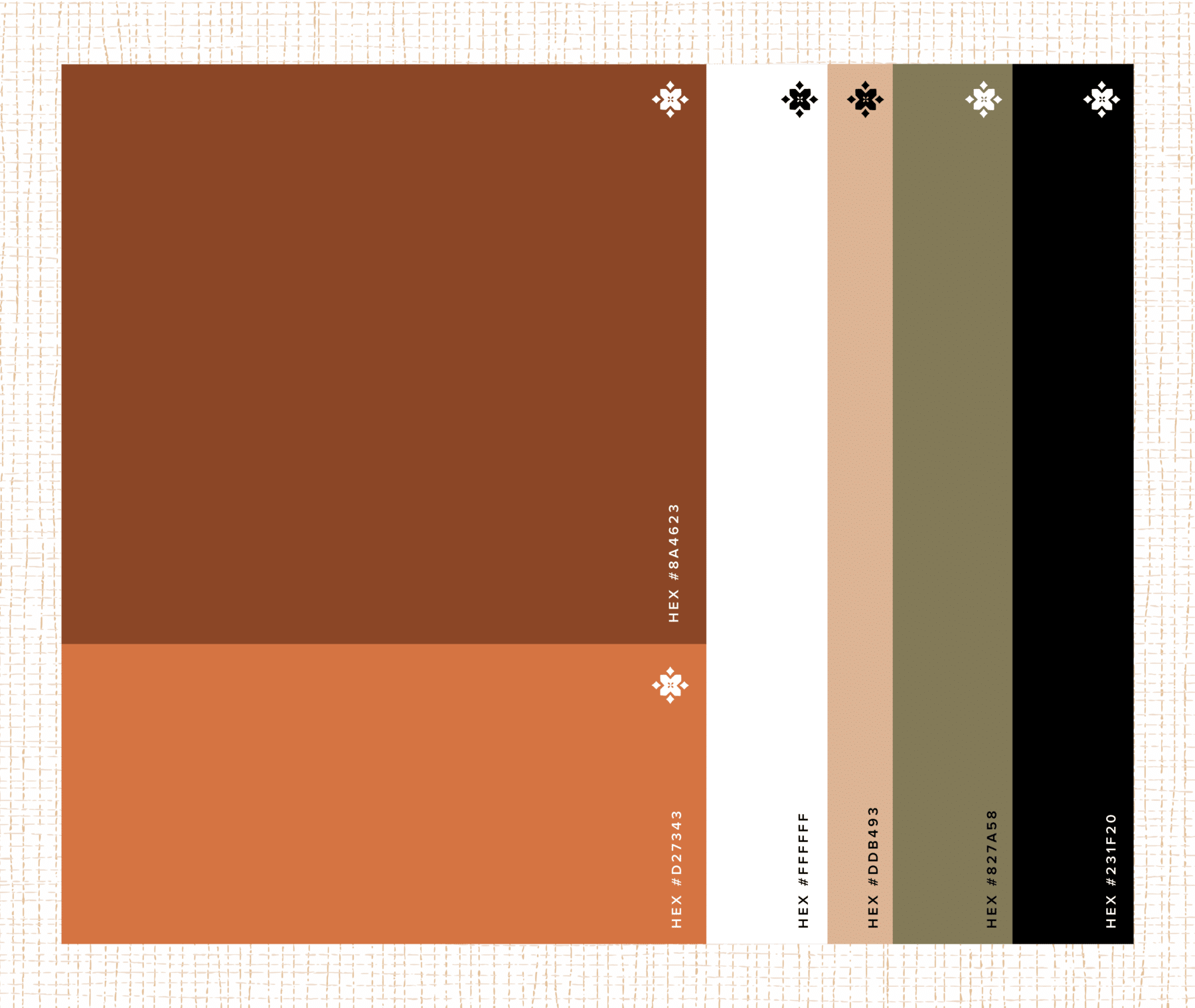
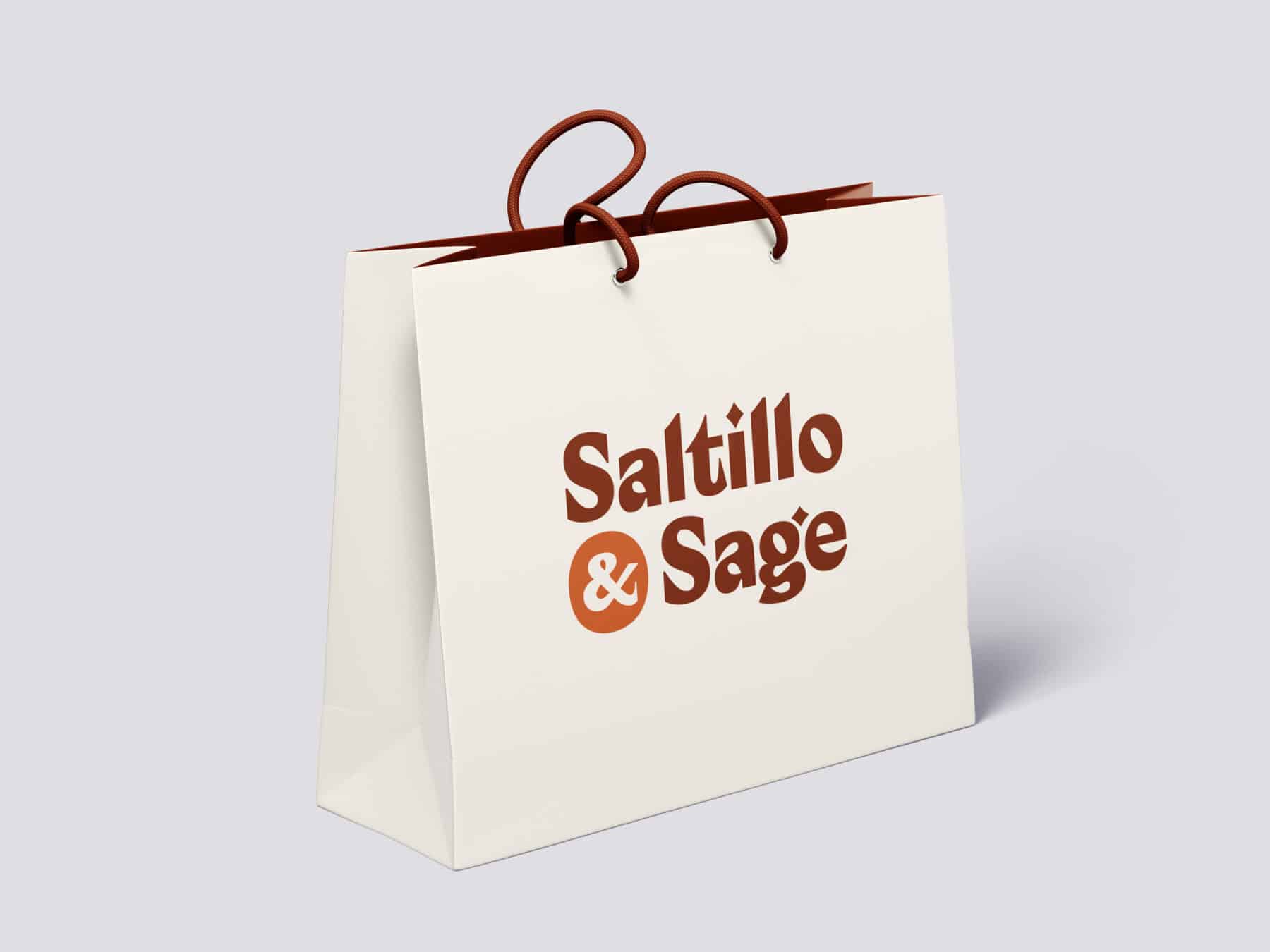
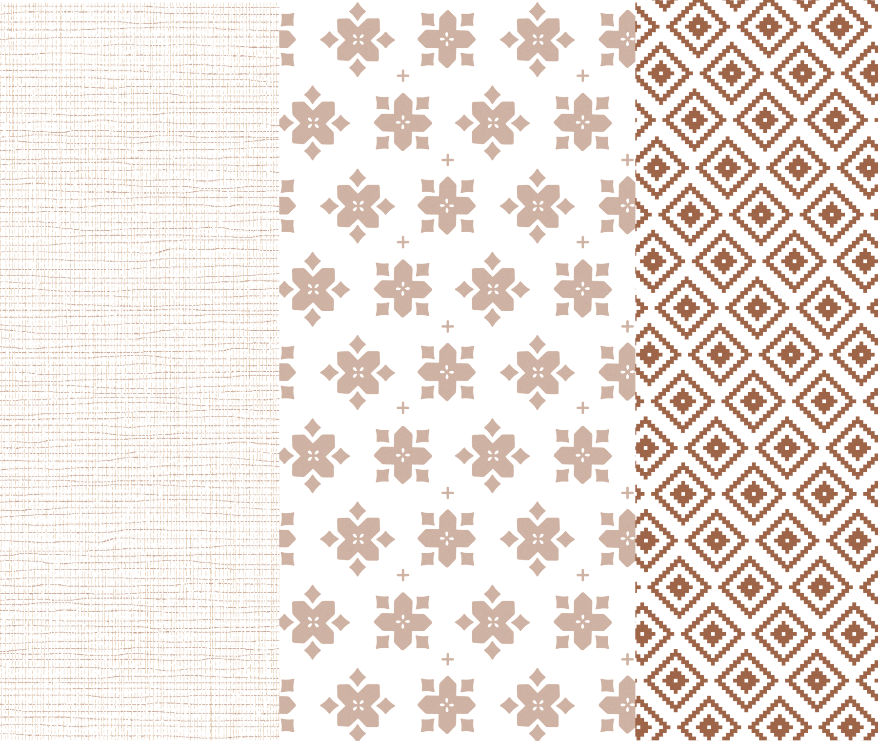
Saltillo & Sage
A logo, color and pattern system, and signage design for local gift boutique at Phoenix Sky Harbor airport celebrating the desert southwest. We assisted the client with naming, and then built the brand around the funky, handmade shapes of traditional terracotta tiles.

-
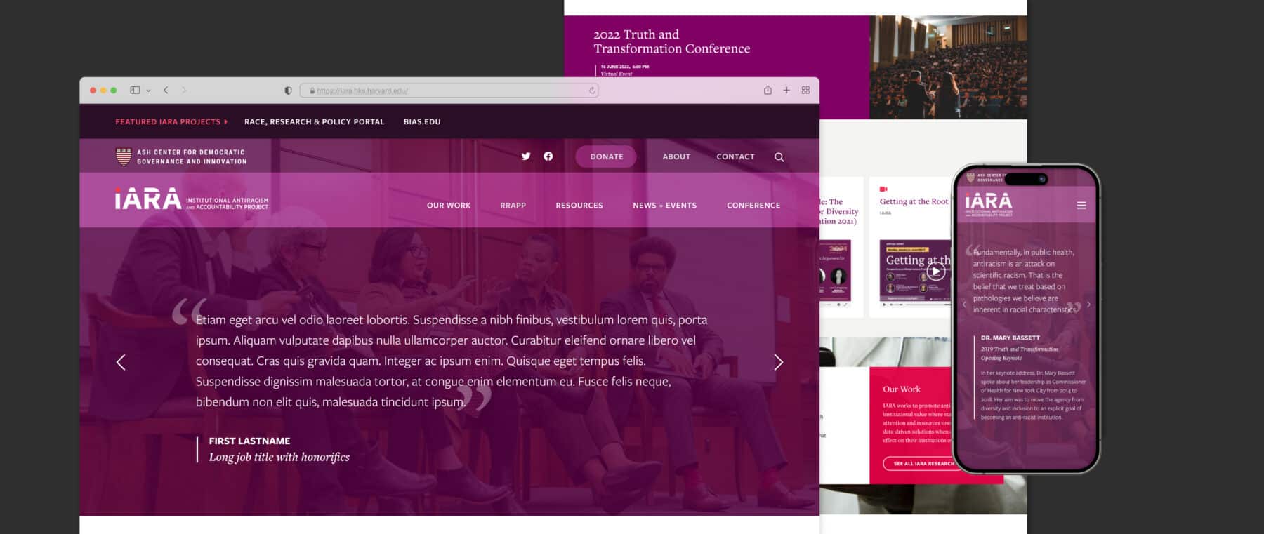
IARA
The Harvard Institutional Antiracism and Accountability (IARA) Project works at the intersection of community, academia, and policy to address intellectual and practical questions as they relate to antiracism policy, practice, and institutional change. We worked closely with the IARA team to develop a website that showcases the various projects, research, and resources they make available to the public. The site showcases their projects. annual conference, latest news, video content, and growing team.
-
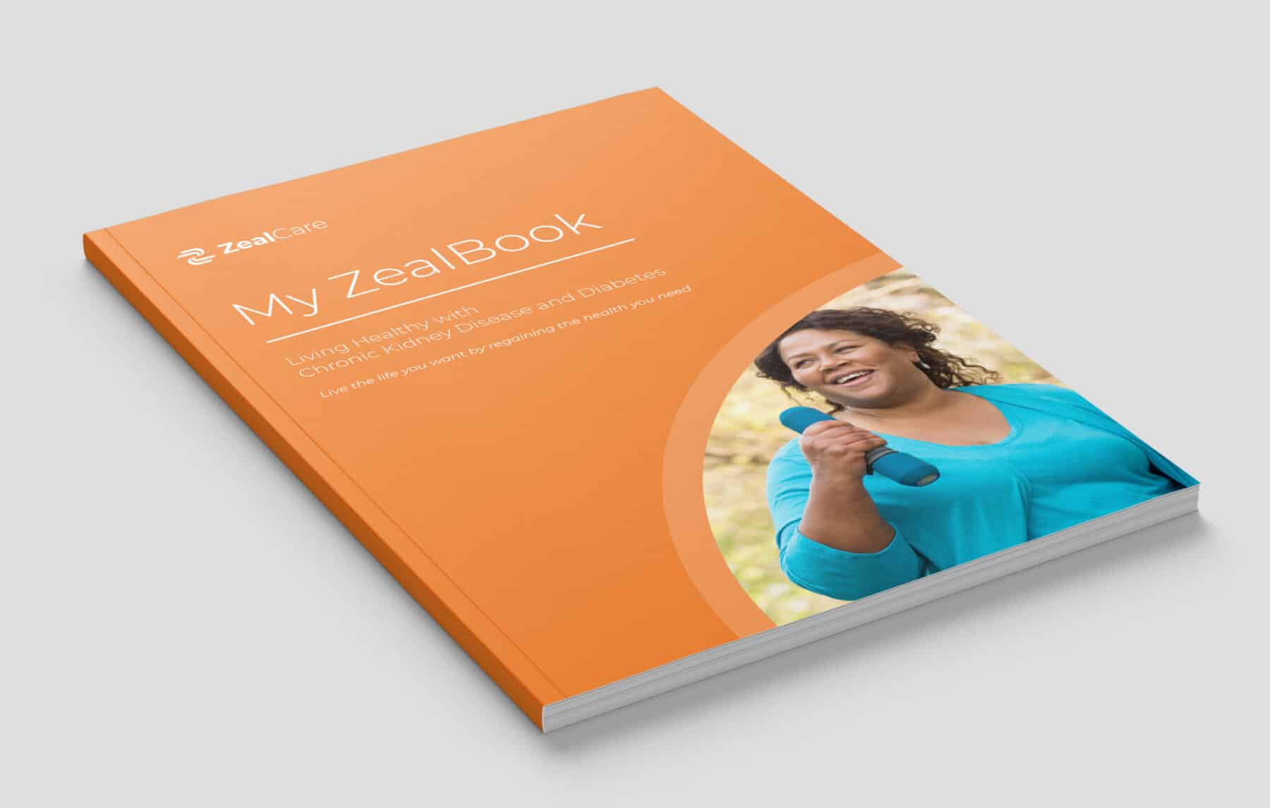
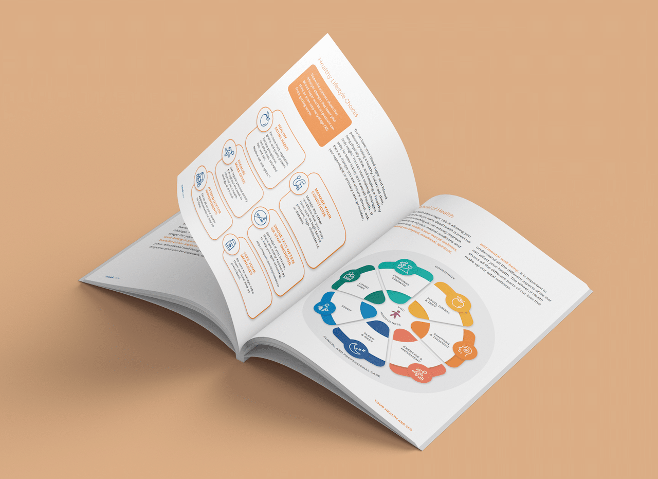
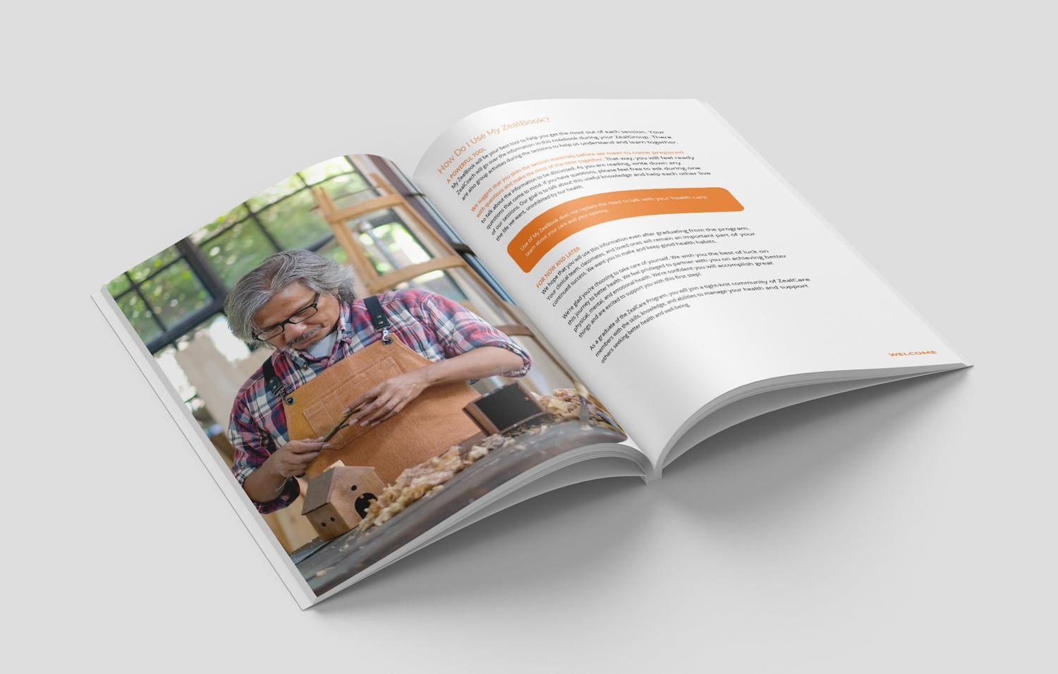
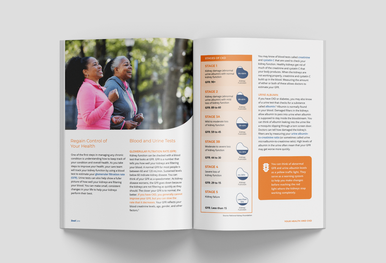
Zeal Workbooks
We worked with Zeal to design an interactive workbook for their continuity of care program, with varieties for multiple long term conditions. With physician-created content, the workbook is a living document that allows participants to keep and reference information, as well as take notes and set goals as they move through the program. We designed this workbook and its accompanying graphics with care especially for adults ages 55–75.
-
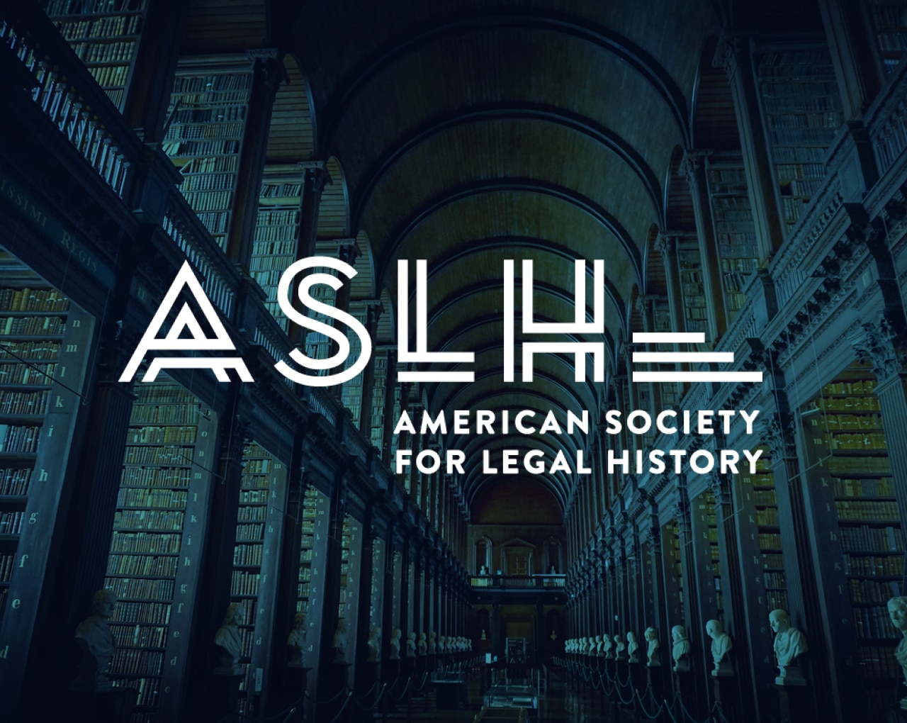
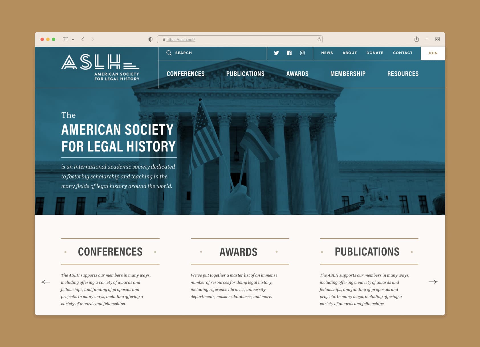
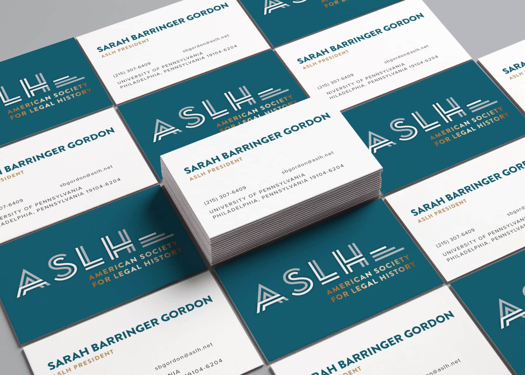
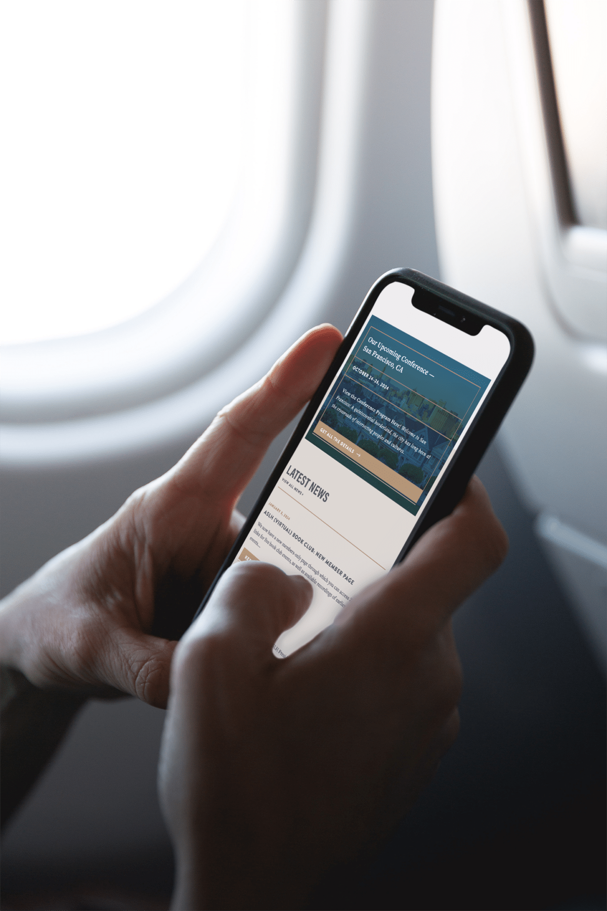
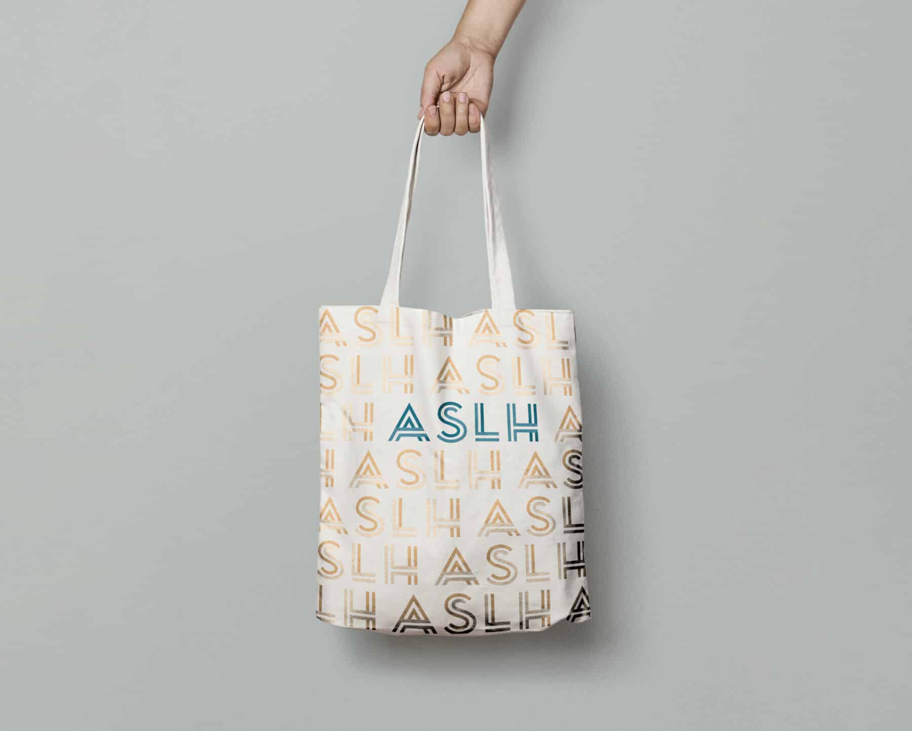
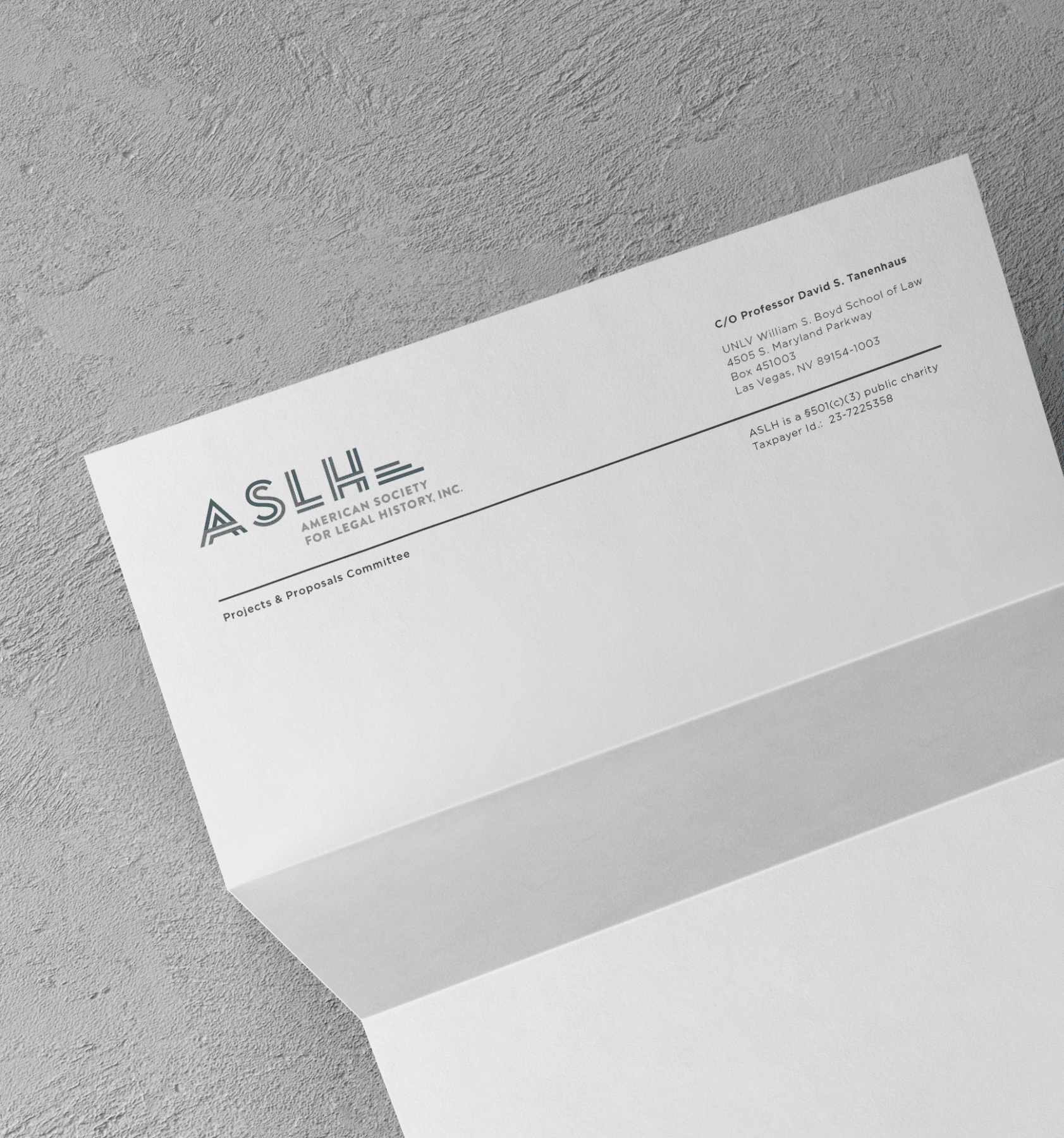
The American Society for Legal History
A logo for the American Society for Legal History, an academic society with a vibrant intellectual energy and culture. Many American courthouses date from the art deco era and share common features, such as wide front steps. These elements inspired a word mark with art deco roots and a structural feel. It allows opportunities for dimensionality and texture, and feels influenced by history without being archival.
-
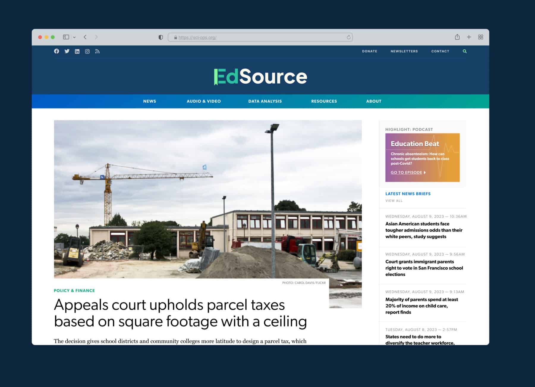
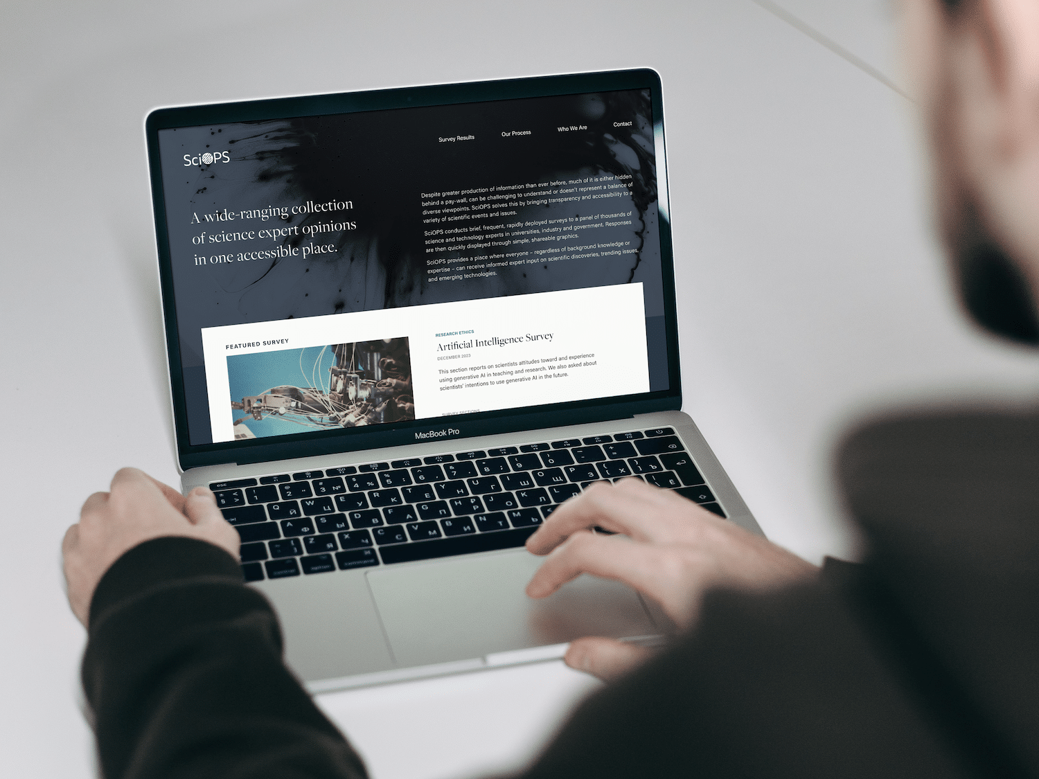
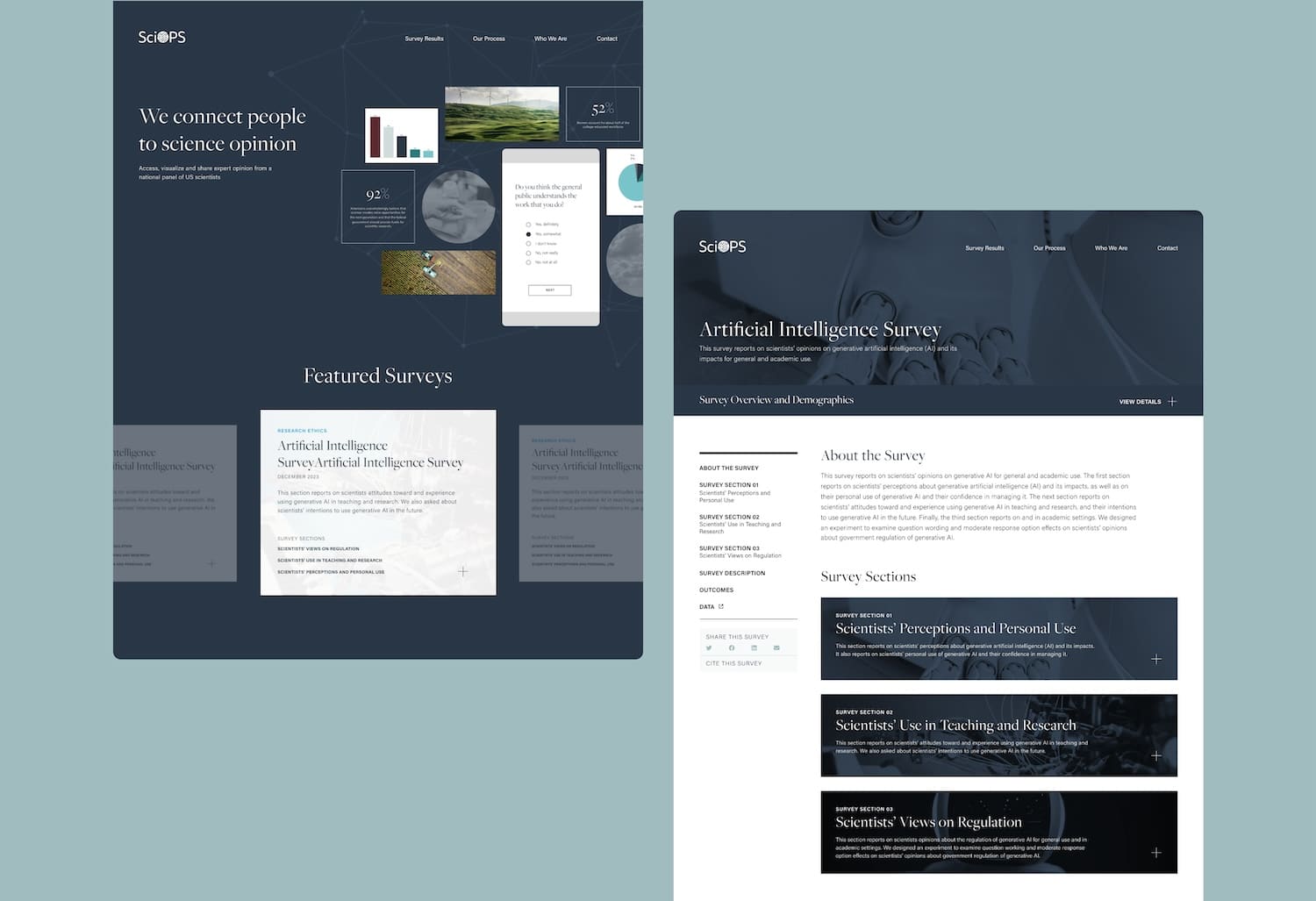
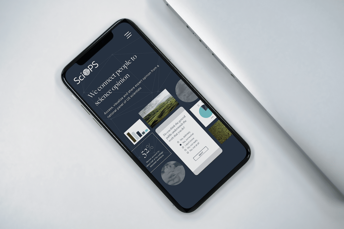
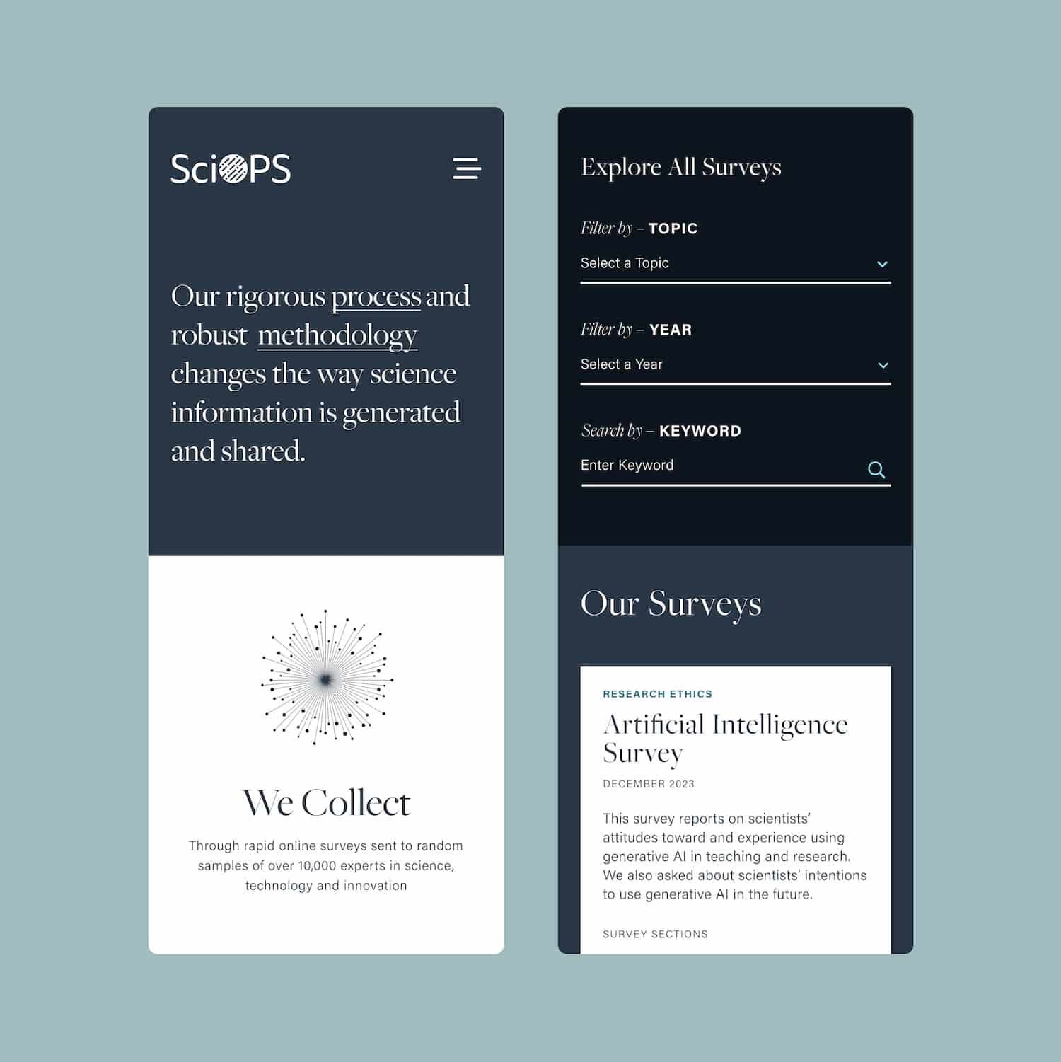
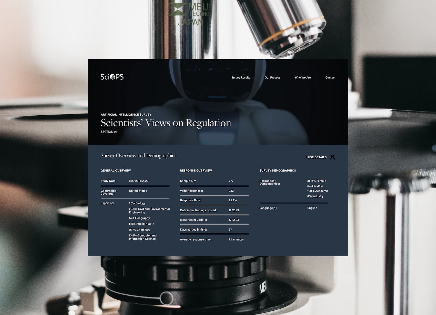
ASU Sci-Ops
We extended the design system originally created by Fervor Design to adapt the website to new needs and make it easier for the unit to administer.
-
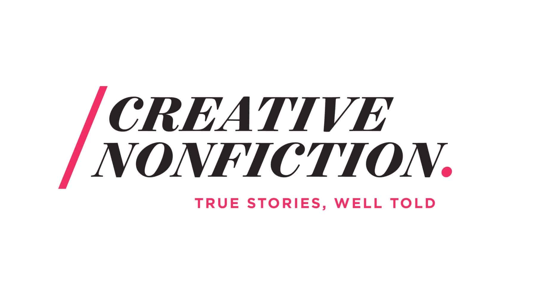
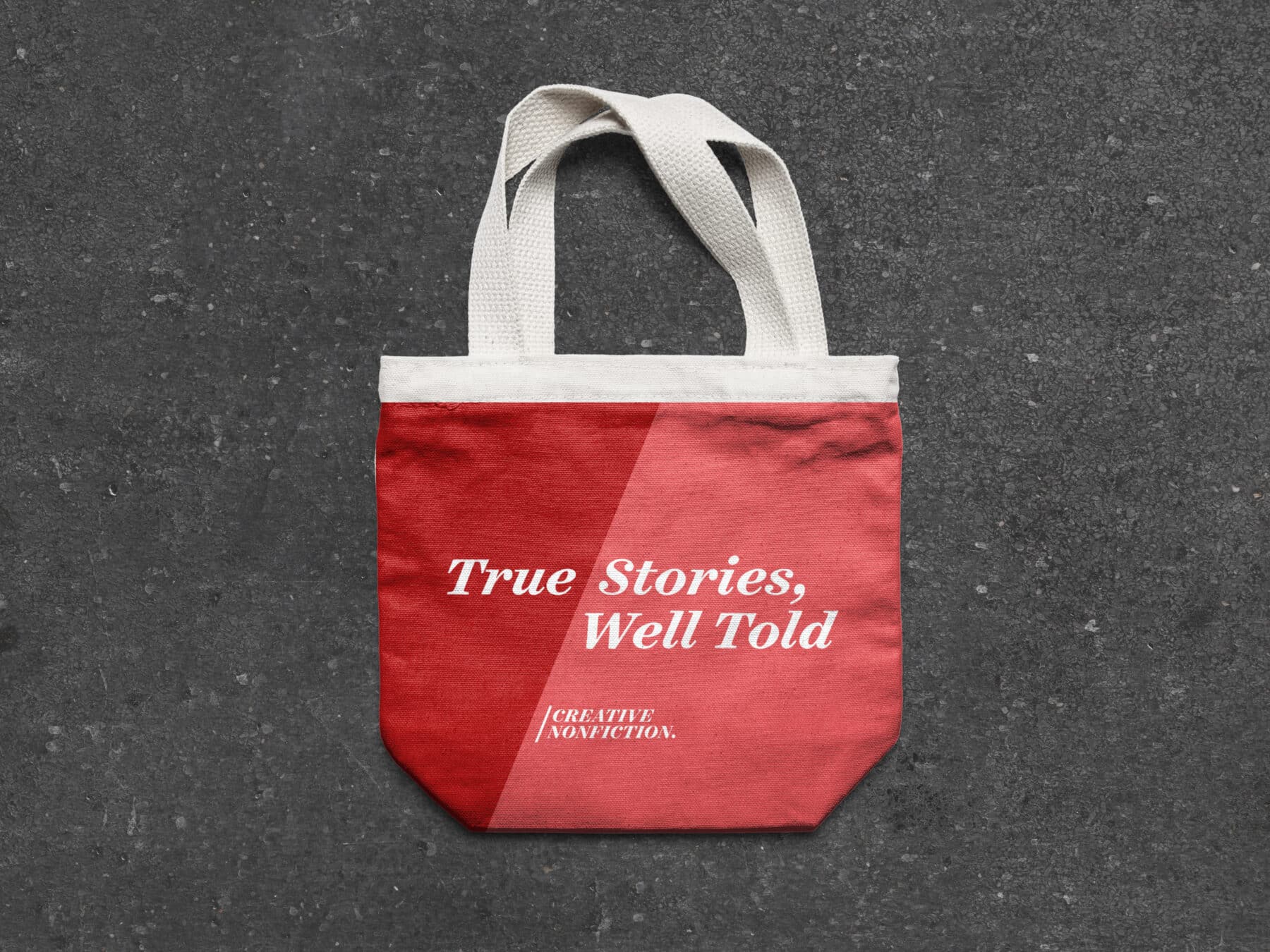
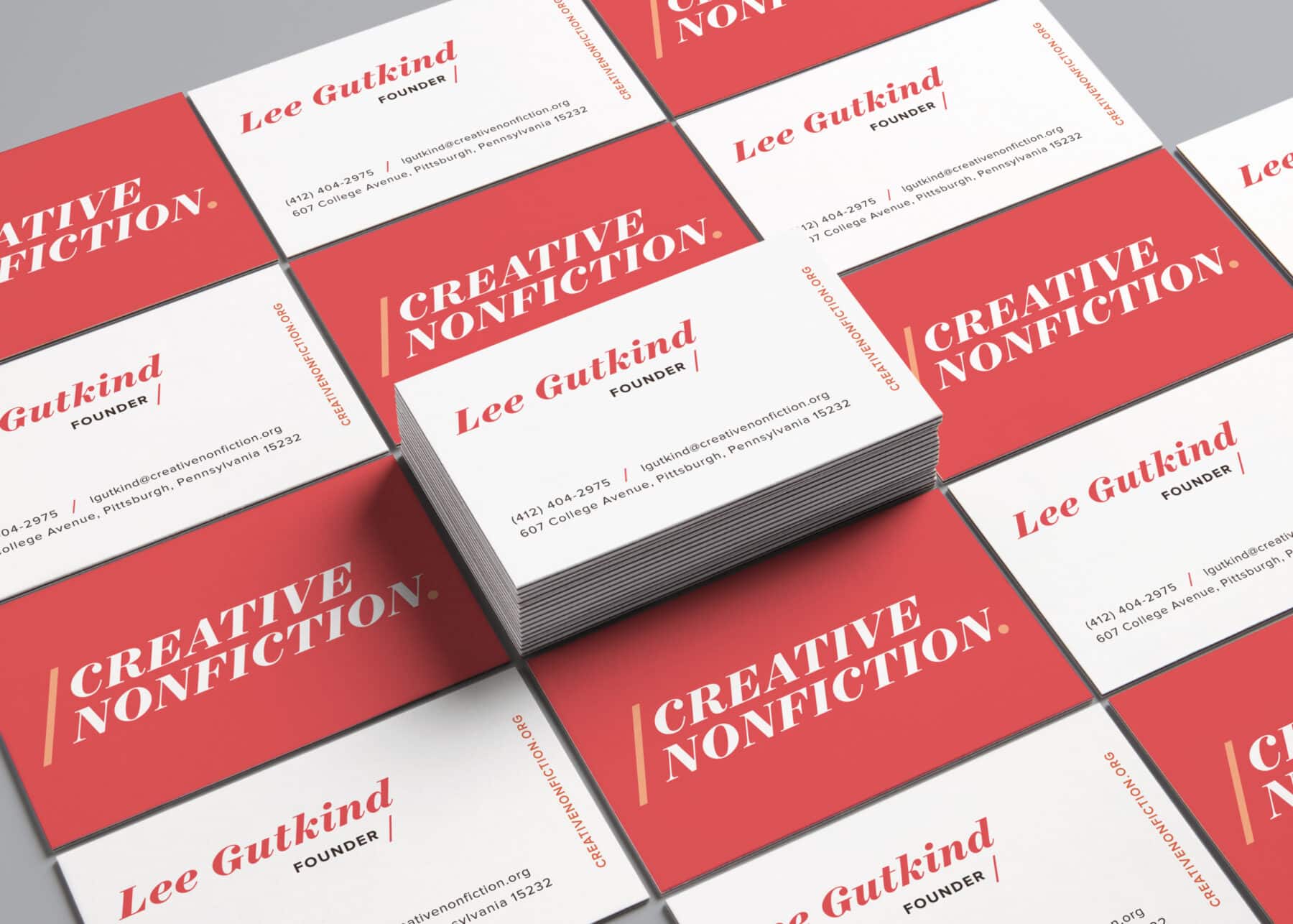
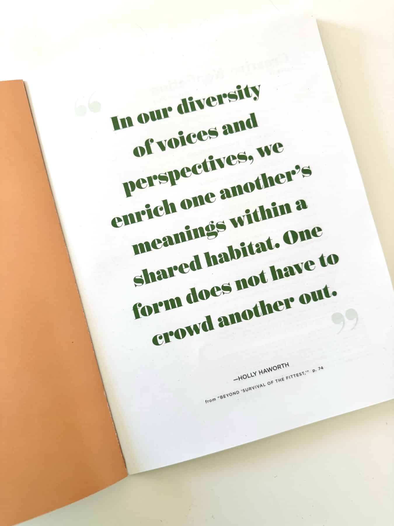
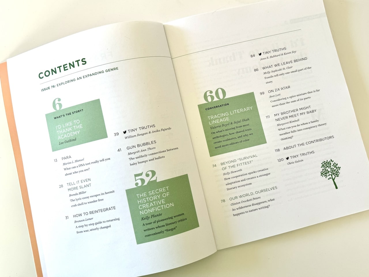
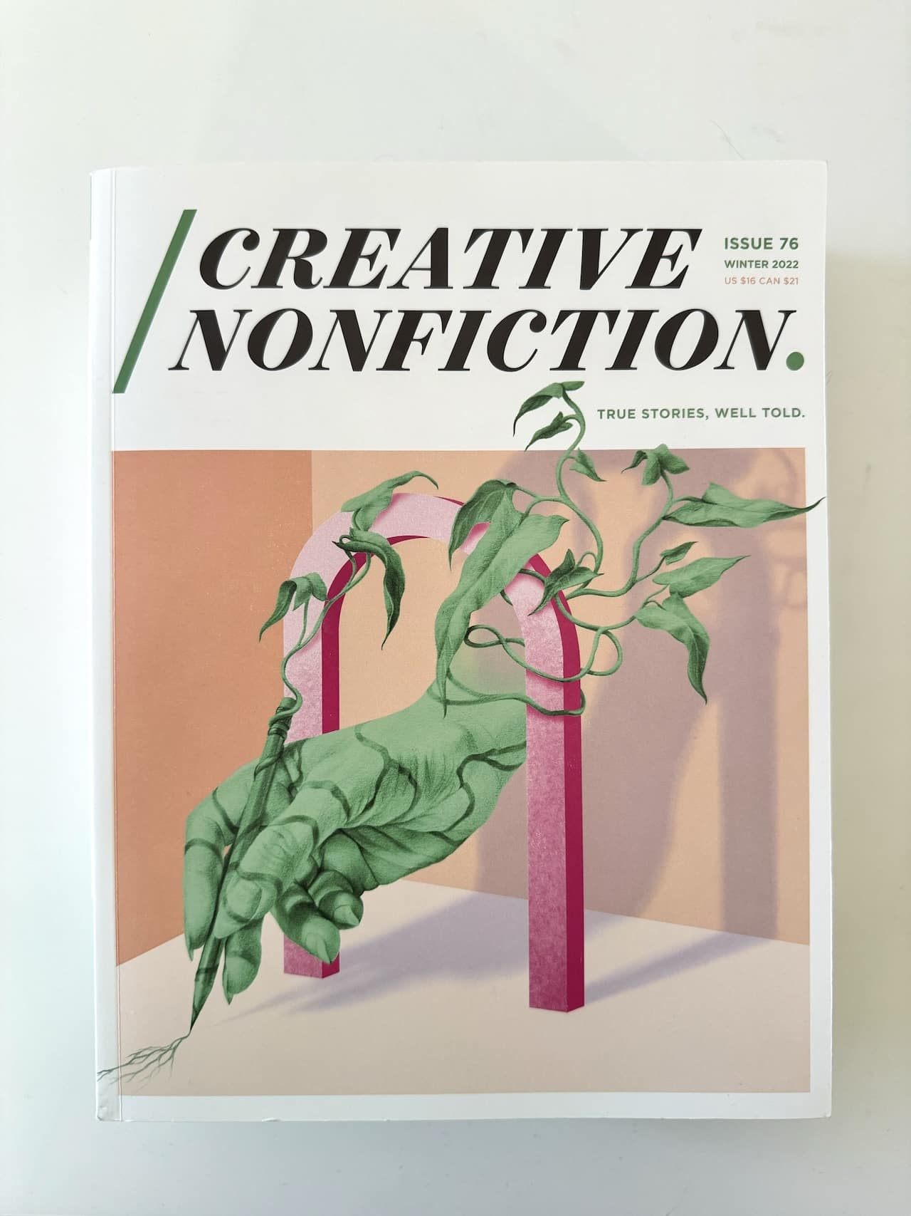
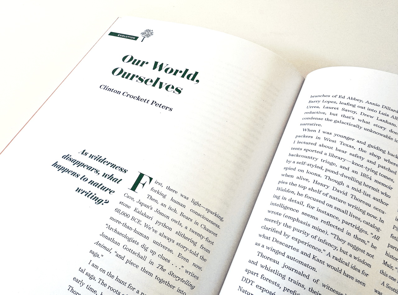
Creative Nonfiction
Creative Nonfiction is the defining literary magazine of the genre, and came to us for an all-encompassing brand refresh that included a new logo, a redesign of their beloved magazine, and a completely rebuilt website. We redesigned the magazine from the ground up, working with their longtime printer to maximize cost-effectiveness while putting out a magazine that felt like a special keepsake with each issue. We designed over a dozen layout types that could be used and modified with each publication, including new sizing, color, typography and artwork guidelines.